In this post, I seek to explore nationwide gdp growth correlation through a graphical model approach. We begin with a dataset of nations and their GDPs.
Our GDP matrix has missing values, so I choose to directly delete countries that have no GDP rates reported. Then, for a given country, I replace NA’s with the mean value of the reported growth rates across the years.
#load dataset
load("gdp.Rdata")

#remove all full-na rows
gdp = gdp[apply(gdp,1,function(x)any(!is.na(x))),]

#replace na values in each row with the row mean
ind <- which(is.na(gdp), arr.ind=TRUE)
gdp[ind] <- rowMeans(gdp,  na.rm = TRUE)[ind[,1]]
Given each country, we use the Lasso regression to find out the countries whose GDP growth rates are significantly associated with that countries. To implement this, first we create a d x d matrix of zeroes, M, where d is the number of different countres in the dataset. This will be our adjacency matrix.For each country, we apply Lasso so that we can find the neighborhood ofevery node and thus recover the whole graph. In particular, we call the glmnet in R to regress the GDP growth rate of the country over the GDP’s growth rates of all other countries.
d = dim(gdp)[1]
M = matrix(0, nrow = d, ncol = d)
We transpose the dataframe for taking regressions.
library(glmnet)
gdp <- t(gdp)
gdp <- as.data.frame(gdp)
gdpM <- data.matrix(gdp)
Now we build an adjacency graph by running regressions for each country’s GDP data upon the others.
for (j in 1:d)
{
  train.y = gdpM[,j]
  train.x = gdpM[,-j]
  m1 = glmnet(train.x, train.y, alpha = 1, family = "gaussian", lambda = 1)
  coefs = coef(m1)[-1]

  coefs2 = vector("numeric", length = d)
  coefs2[1:j-1] = coefs[1:j-1]
  coefs2[j] = 0
  if (j != d)
  {
    coefs2[(j+1):d] = coefs[j:(d-1)]
  }
  M[j,] = as.numeric(coefs2 != 0)
}
We use an “and” rule, which is to say that we deem two countries as conditionally dependent if and only if they both include each other as features in their regressions. We thus apply this “and” rule to our matrix.
for (j in 1:d)
{
  for (k in j:d)
  {
     if (M[j,k] != 0 || M[k,j] != 0)
     {
        if (M[j,k] == 0 || M[k,j] == 0)
        {
          M[j,k] = 0;
          M[k,j] = 0;
        }
     }
  }
}
Finally, we plot this graph, where any node with degree greater than 5 is colored red:
library(igraph)

graphplot=function(X){
    ag=graph.adjacency(X, mode="undirected")
    V(ag)$colors=ifelse(degree(ag)<5, 'SkyBlue2', 'red')
    png(filename="gdp_nodewise.png", height=800, width=800)
    par(mai=c(0,0,0,0))
    plot.igraph(ag, vertex.color=V(ag)$colors, vertex.size=6, vertex.label.cex=0.8, layout=layout_nicely(ag))
    dev.off()
}
graphplot(M)
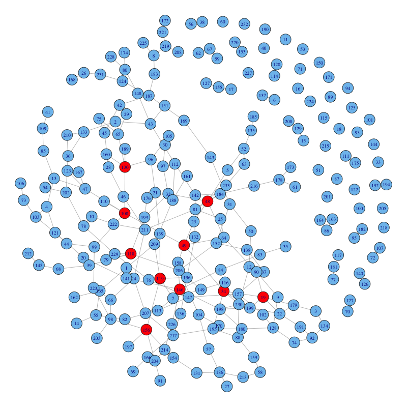
According to the plot, the countries that are red are numbered 118,119, 146, 156, 48, 49, 34, 19, 108, 130. The corresponding countries are:
colnames(gdpM)[c(118,119,146, 156, 48, 49, 34, 19, 108, 130)]

##  [1] "Libya"                          "St. Lucia"
##  [3] "Montenegro"                     "Nigeria"
##  [5] "Cyprus"                         "Czech Republic"
##  [7] "Central Europe and the Baltics" "Bulgaria"
##  [9] "Cambodia"                       "Latvia"